Popular Categories
New Arrivals
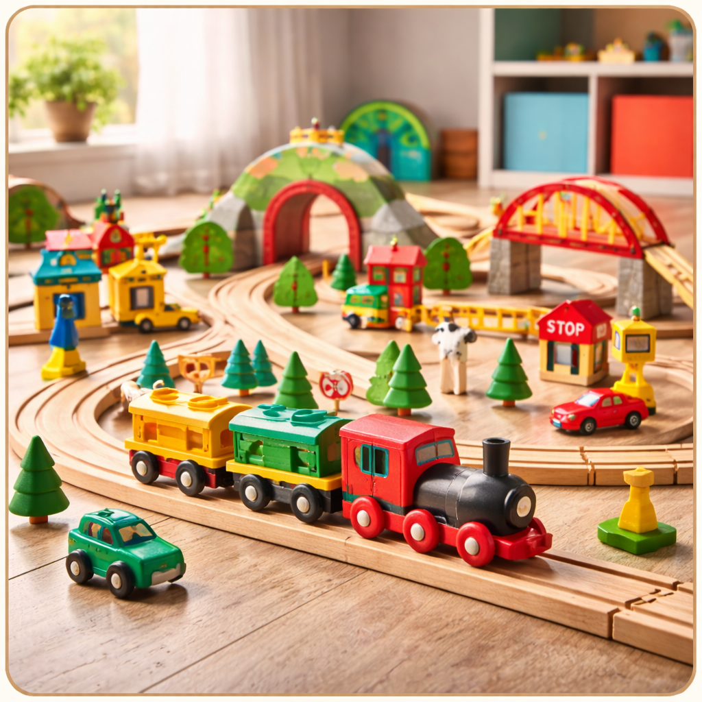
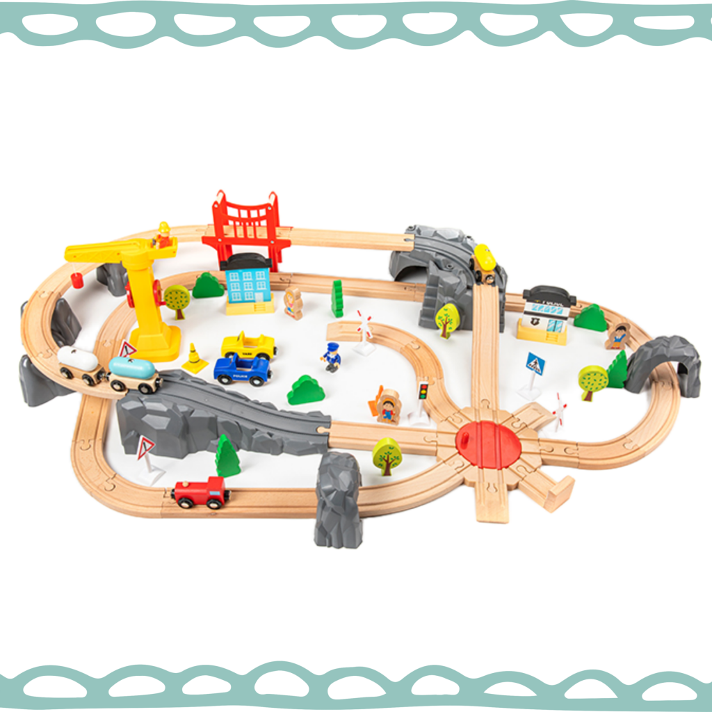
Wooden Train Play Set for Toddlers – 80-Piece Educational Railway Toy
In stock
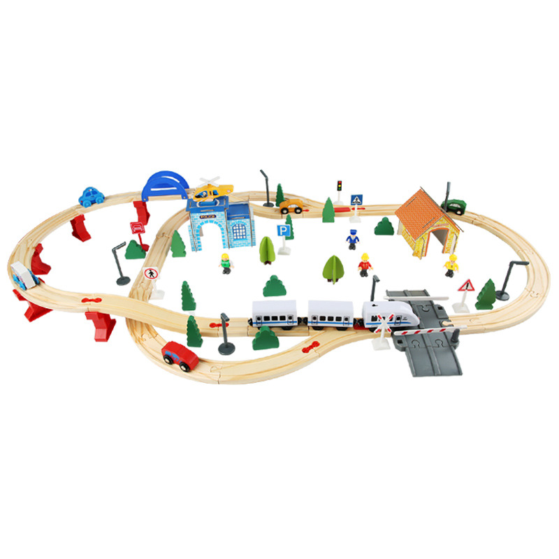
Wooden Train Play Set for Toddlers – Battery Locomotive & Track Set
In stock

Puzzle for fun
Cuqup Baby Walker and Rocker That Converts – 3-in-1 Walk, Scoot and Rock (Blue)
In stock
Cuqup Baby Walker and Rocker That Converts – 3-in-1 Walk, Scoot and Rock (Pink)
In stock
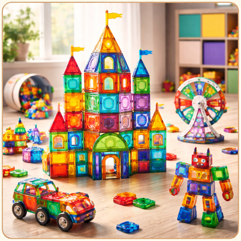
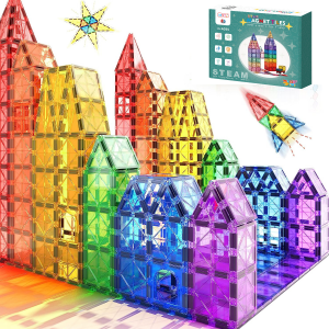
Magnetic Tiles Building Set for Kids – 108 PCS Educational STEM Toy
In stock

Let's start a fun ride!
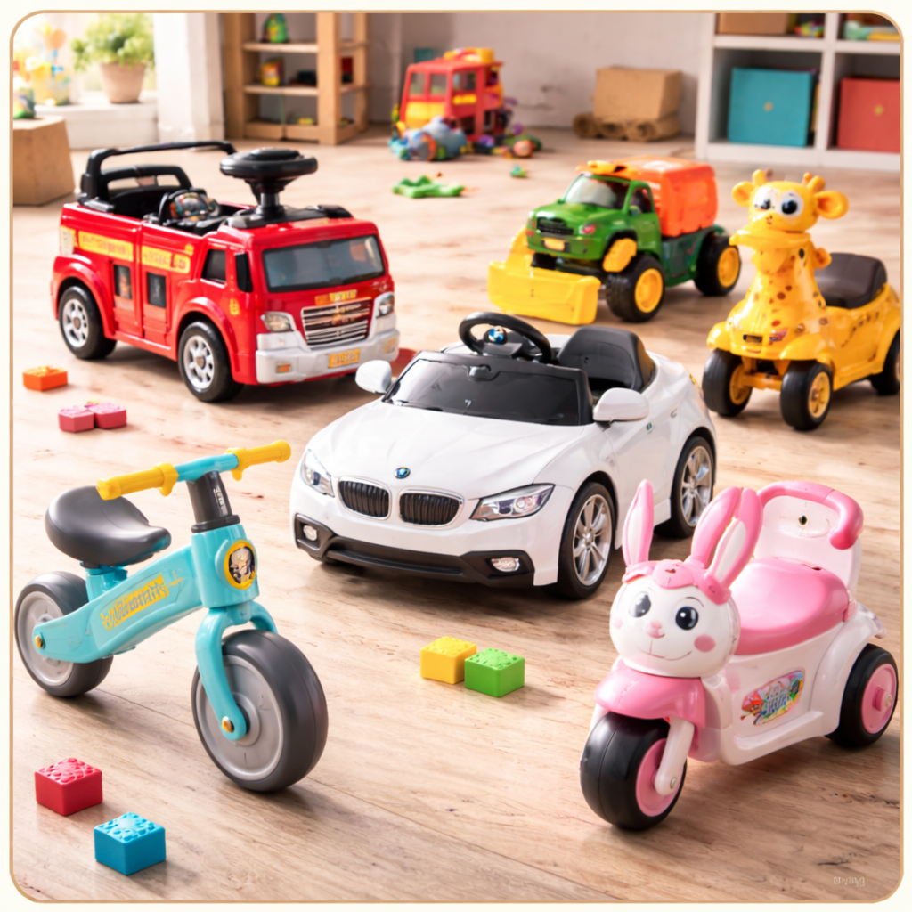
Hurry and get discounts on all ride-on toys up to 20%!
Cuqup Baby Walker and Rocker That Converts – 3-in-1 Walk, Scoot and Rock (Pink)
Cuqup Baby Walker and Rocker That Converts – 3-in-1 Walk, Scoot and Rock (Blue)
Ride On Train (Train Carriage)
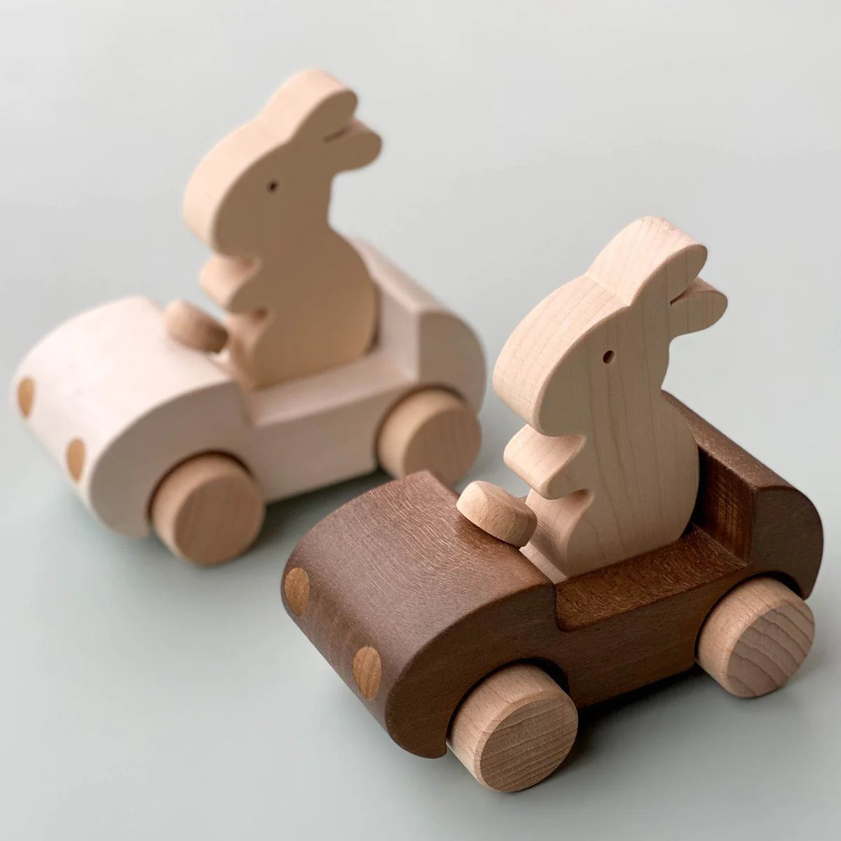
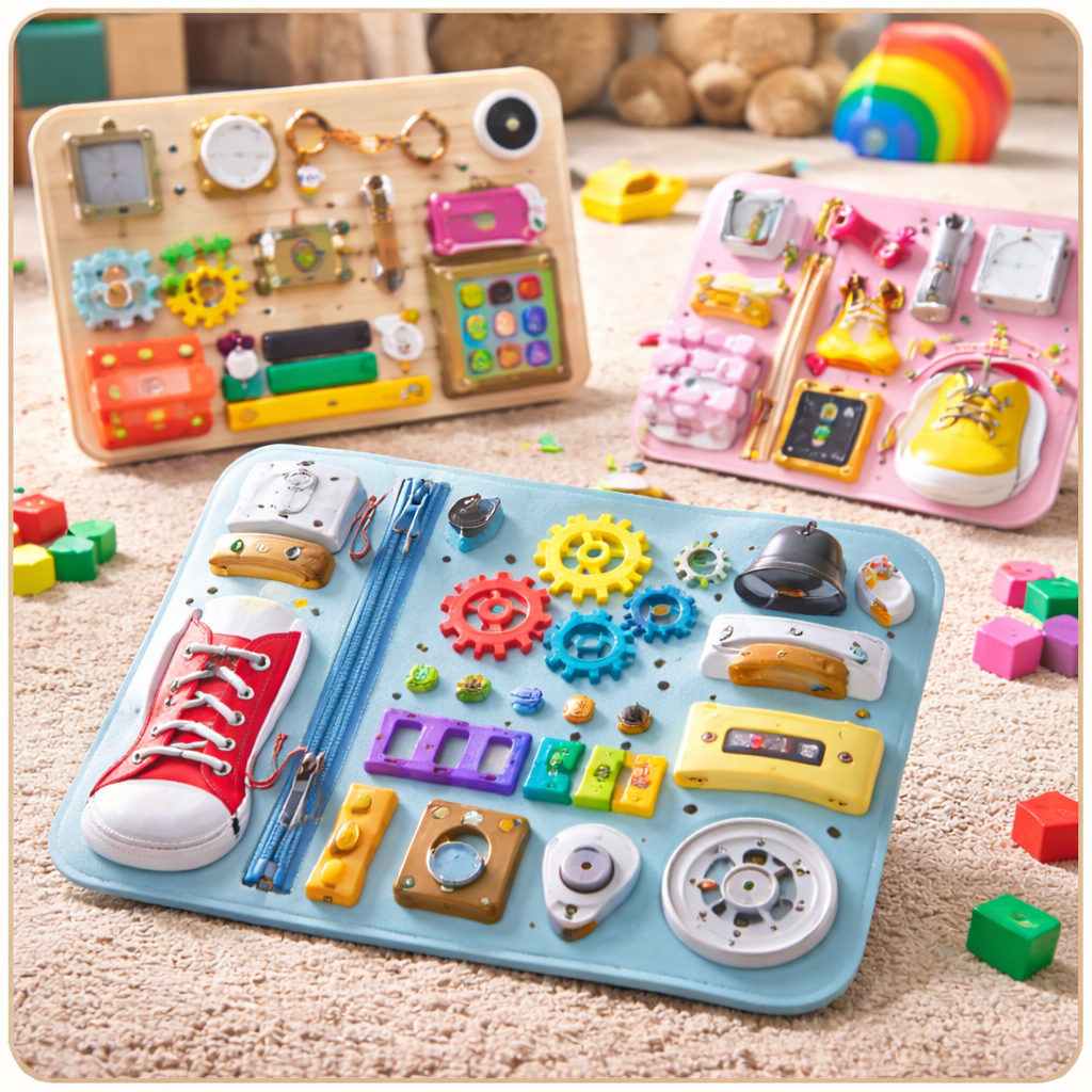
ALL-in-1 Wooden Activity Board


Cuqup Baby Walker and Rocker That Converts – 3-in-1 Walk, Scoot and Rock (Blue)
In stock
We are available on


Recently Viewed
Our Articles
Best Gaming Laptop Models
At solmen va esser necessi far uniform grammatica, pronunciation e plu sommun paroles…
How to choose a HI-FI stereo system
Nullam dictum felis eu pede mollis pretium. Integer tincidunt. Cras dapibus. Vivamus elementum semper nisi…
Logitech POP Keys
Maecenas nec odio et ante tincidunt tempus. Donec vitae sapien ut libero venenatis faucibus. Nullam quis ante. Etiam sit amet orci…
Cameras for Street Photography
3 Minimalist Desk Setups
Online store of household appliances and electronics
Then the question arises: where’s the content? Not there yet? That’s not so bad, there’s dummy copy to the rescue. But worse, what if the fish doesn’t fit in the can, the foot’s to big for the boot? Or to small? To short sentences, to many headings, images too large for the proposed design, or too small, or they fit in but it looks iffy for reasons.
A client that's unhappy for a reason is a problem, a client that's unhappy though he or her can't quite put a finger on it is worse. Chances are there wasn't collaboration, communication, and checkpoints, there wasn't a process agreed upon or specified with the granularity required. It's content strategy gone awry right from the start. If that's what you think how bout the other way around? How can you evaluate content without design? No typography, no colors, no layout, no styles, all those things that convey the important signals that go beyond the mere textual, hierarchies of information, weight, emphasis, oblique stresses, priorities, all those subtle cues that also have visual and emotional appeal to the reader.


